Cost Optimization Billing Widgets
I spearheaded an end-to-end product design initiative for LogicMonitor to visualize cloud infrastructure costs. Within a 90-day sprint, I delivered a high-fidelity suite of widgets that enabled users to monitor their overall costs and pinpoint cost drivers. Beyond its initial release, this framework became a design pillar for cost optimization landing page, driving $750k+ in the first year of the product with 21 new customers, exceeding 2025 annual goals.
My Role
Timeline
Teammates
Status
Tools
Overview
Bridging the Gap in Multi-Cloud Visibility.
As a core component of LM's new Cost Optimization (CO) product, which empowers ITOps and FinOps to monitor their cloud costs and save costs by adjusting underused or oversized resources, Billing enhances LM's Cloud Infrastructure monitoring by visualizing expenditures and enabling users to slice and dice data. This allows for deep-drills into the specific contributors and drivers behind shifting cloud costs.
The product suite encompasses a comprehensive landing page, Cost Optimization Recommendations, Cost Explorer, and Budgets. To establish a robust foundation, we prioritized the design and development of Billing Widget, the modular dashboard visualizations that serve as the primary entry point for cost transparency across the platform.
Why it matters
Build a full observability platform and reduce user frictions.
The goal of this project was to bridge a critical gap in our observability platform: a native, cost-focused monitoring tool for infrastructure. In this context, cost is more than just a financial metric. It is a primary indicator of deployment efficiency and resource health.
The existing solution relied on an external AWS QuickSight integration that was disconnected from user's primary workflow and out of control by the engineers, resulting in low engagement and high maintenance costs. My mission was to eliminate this friction by designing a customizable, end-to-end cost monitoring experience native to the LogicMonitor ecosystem.
Business goals & metrics
- Increase ARR (Annual Recurring Revenue)
- Increase account adoption
- Reduce costs (3rd party integration)
Design goals
- Intuitive
- Transparent
- Trustable
Constraints
Maneuver infra vs. cost optimization filters
Integrating billing experience into LM Dashboard, built for infrastructure monitoring has been the blocker of building LM native billing widgets. Architected for infrastructure performance metrics, Dashboard has a time granularity and filtering logic that didn't align with cost-management use cases.
Tight timeline
As a legacy QuickSight dashboard already existed, stakeholders initially perceived the design effort as a simple migration rather than a full reimagining. I had to balance intense engineering pressure for immediate delivery with the need to ensure these foundational components were scalable and truly user-centric, rather than just duplicating the previous tool's limitations.
Revisit use cases
What are we building?
Challenged by running a full-cycle discovery research without existing users, I did a guerrilla research by talking to sales engineers, researching the FinOps Foundation, studying Gong recordings, and running competitive analysis to collect insights. With these conversations, the design problem I need to address is:
End-to-end user flow
- Add cloud accounts for monitoring
- Create widget and build dashboards
- Receive alerts
- Check budget
- Drill down and analyze
- Cost Optimization suggestions
Workflow
How did I ship design in a tight timeframe?
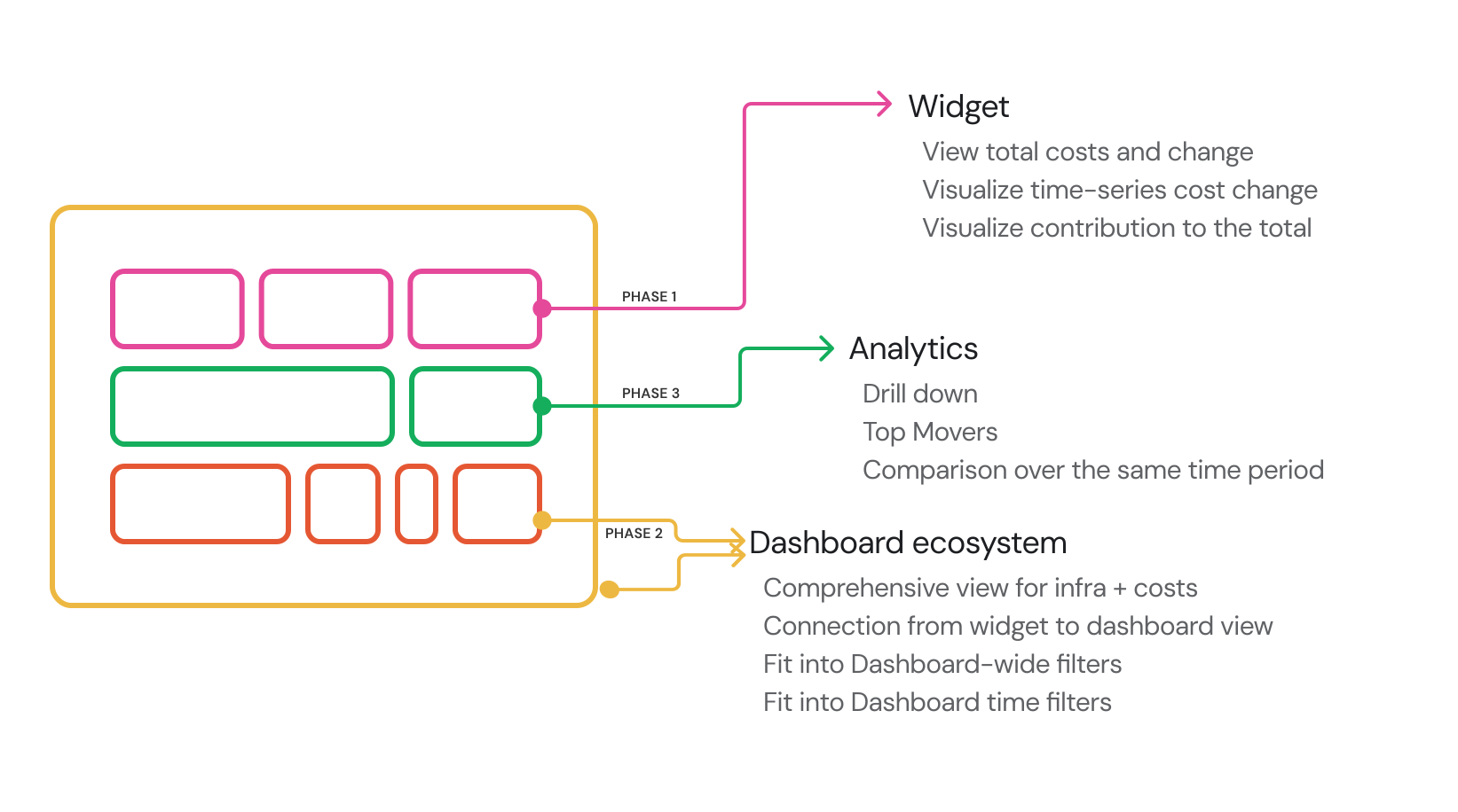
Faced with a tight timeline, I collaborated with Charlie to restructure the design into three phases. This approach mirrored the dashboard's modular widget architecture, allowing the team to utilize an Agile workflow and ensure an on-time delivery.
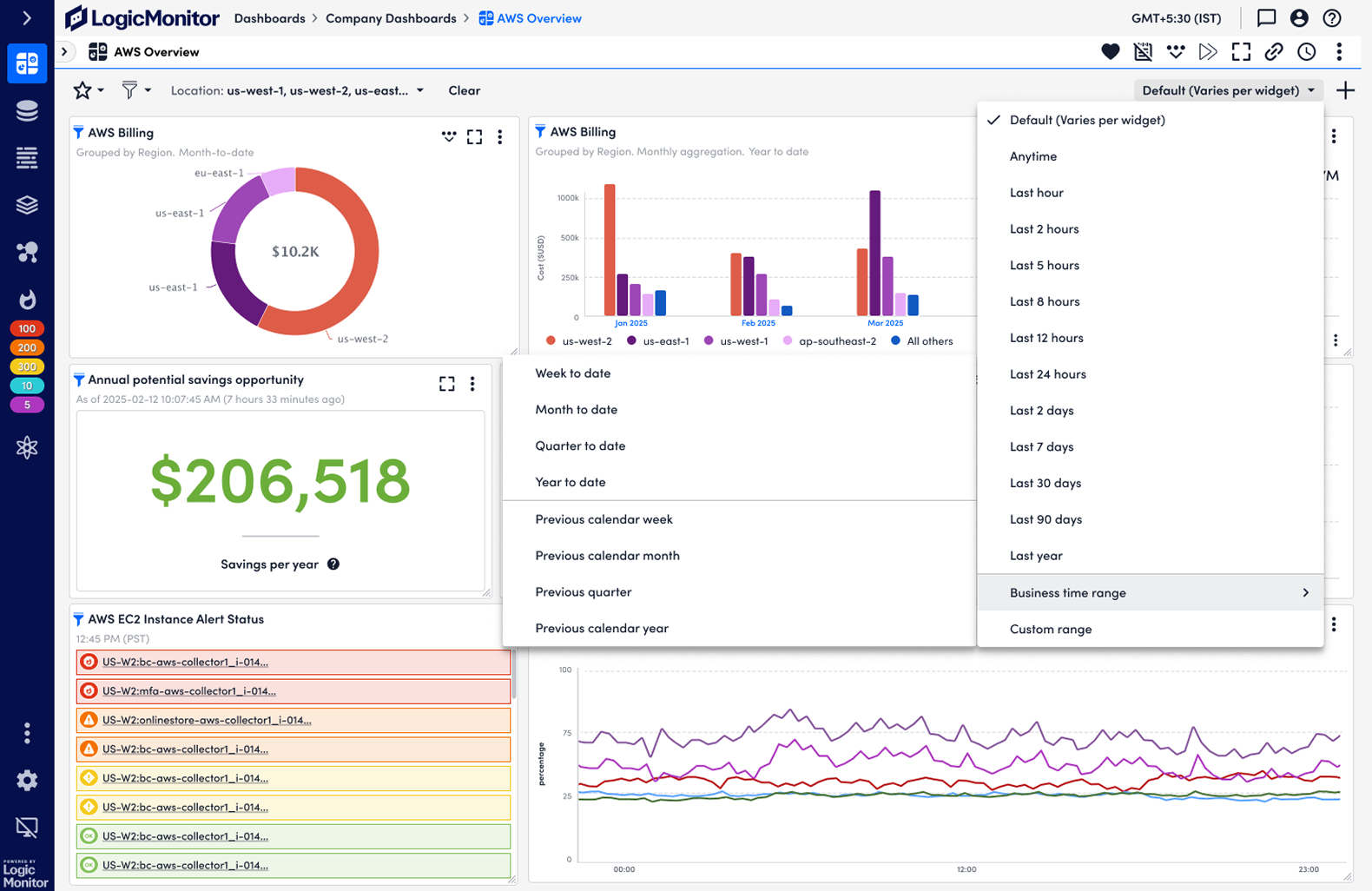
We began by focusing on the core feature of the Billing widgets: displaying the costs users incur for their selected cloud resources. Starting at the individual visualization level, we have finalized designs for high-level metrics, trends over time (line, bar, and stacked area charts), and cost breakdowns by contributor (donut charts). Moving forward, our primary focus is streamlining the widget creation flow, defining key charts, and ensuring the interface highlights actionable billing data rather than standard infrastructure monitoring metrics.
With the core visualizations complete, our focus shifted to seamlessly integrating them into the broader dashboard ecosystem and ensuring they meet core FinOps use cases for searching and filtering. The primary challenges in this phase involve resolving misaligned time granularities and innovating the connection between individual widgets and the overall dashboard. While this widget-to-dashboard interaction is a novel pattern for the platform, it is essential for providing users with a comprehensive filtering lens. Resolving this interaction model is our final blocker prior to release.
Design considerations
Key Design Pivots
1.How might we make it easier for FinOps team to observe cross-platform costs?
As part of the fundamental needs of cross-platform observability and cost monitoring, FinOps need to know the right number and change over time. In addition, according to FinOps Foundation, FinOps will need to know the cost ownership before analysis. Displaying the number, stacked bar chart, stacked area chart, and donut chart meet these needs sufficiently.


 us-west-2
 us-east-1
 us-east-2
 us-west-1
 eu-east-2
- us-west-2
- us-east-1
- us-east-2
- us-west-1
- eu-east-2
Total cost: $ 30.73M
- global
- us-west-2
- us-east-1
- eu-west-1
- ap-southeast-2
- All others
Total cost: $ 30.73M
- global
- us-west-2
- us-east-1
- eu-west-1
- ap-southeast-2
- All others
2.How might we enable FinOps to triage unexpected spend changes?
When FinOps are viewing a Billing dashboard and monitoring costs, when they found any spike, they need to triage it to the responsible group before further investigation. A cost figure on its own says little. The design question at this stage was how to let users drill down and, at every level, understand what the cost is attributed to.
Control as widget actions + Inline legend
Drill-down lives in the widget's own controls, and the chart stays a chart. Press the arrow and the same $30.73M comes back cut by account instead of by region; press the up arrow and it goes back. Because nothing is ever selected, the control can only answer how finely — there is no way to ask about one region, and no path to write down.
us-west-2us-east-1us-east-2us-west-1eu-east-2- us-west-2
- us-east-1
- us-east-2
- us-west-1
- eu-east-2
Diagram interaction + navigation
Shipped
The chart components themselves become the navigation — select a segment to go a level deeper — and a breadcrumb inside the widget holds the path back up. The total in the hole is always the wedge you just clicked, and the subtitle restates the cut, so a number is never orphaned from what it is the cost of.
us-west-2us-east-1us-east-2us-west-1eu-east-2- us-west-2
- us-east-1
- us-east-2
- us-west-1
- eu-east-2
3.How might we assist FinOps to find any abnormal costs?
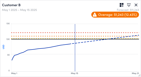
How would FinOps people know whether a cost number worth attention? The answer is showing users cost changes compared to the cost from the last cycle. Trends over Time aims to help users to observe cost changes at a glance. Top Movers helps users quickly identify the cost segment that changes most drastically. Forecast with Budgets warned users when there's an expected overage.
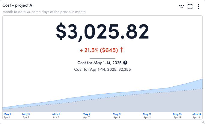
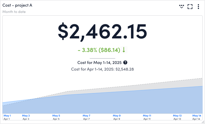
As for Top Movers, the first question is — top mover, by what metric? In fact, both large volume change and percentage (delta) change matter to users. When working on the widget, we keep both metrics in creation.
From there, I explored 3 ways of visual representation:
Text
The movers written out as sentences. Quickest to read one of, slowest to compare many — nothing in a sentence tells you that Analytics fell by six times what Networking rose by, and ranking is what the widget is for.
 Increasing Cost
- Networking from $285.22 to $301.31
- Database from $587.42 to $612.30
- Compute from $4,413.55 to $4,428.87
 Decreasing Cost
- Analytics from $1,099.20 to $943.38
- Management and Governance from $1,076.04 to $976.81
- AI and Machine Learning from $294.15 to $271.52
Diagrams
The movers drawn, largest swing first. Good at showing the size of a change, poor at ranking a dozen of them — and a bar's length can only carry one number, so the percentage has to be written underneath. Compute rose $15.32 on a base of $4,413; Networking rose $16.11 on $285. By dollars those are the same bar.
Net change: −$221.39
Table
Shipped
Ranks by cost change and by percentage — each its own sortable column, so the two metrics that both matter stop competing for one encoding. The chart did not go away, it moved: every row opens thirteen months of its own cost, which is how you tell a spike from a trend.
Increasing Cost Top Movers
| Resource Type Cat… | Chart | Amount change |  % change % change | Current (May 1–14) | Previous (Apr 1–14) |
|---|---|---|---|---|---|
| Networking | $16.09 | +5.64% | $301.31 | $285.22 | |
| Database | $24.88 | +4.24% | $612.30 | $587.42 | |
| Compute | $15.32 | +0.35% | $4,428.87 | $4,413.55 |
Decreasing Cost Top Movers
| Resource Type Cat… | Chart |  Amount change Amount change | % change | Current (May 1–14) | Previous (Apr 1–14) |
|---|---|---|---|---|---|
| Analytics | −$155.82 | −14.18% | $943.38 | $1,099.20 | |
| Management and Gov… | −$99.23 | −9.22% | $976.81 | $1,076.04 | |
| AI and Machine Learni… | −$22.63 | −7.69% | $271.52 | $294.15 |
Whereas users could proactively find any cost spikes, the efforts will be easier when they configure alert thresholds for billing: Budgets. Budgets allow users to track how much they have spent against the budget and surfaces spent-over. For Forecast with budgets, the discussion centers around when should we give users an alert. The primary goal is to help users to act early before the cost breaches budget, but also avoid false alerting of overage.
4.How might we empower FinOps to act on the cost insights?
5.How might we streamline the creation of Billing widgets intuitively?
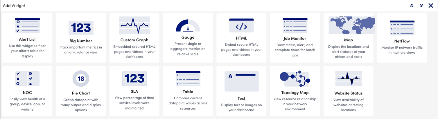
Users may either chose a visualization first, then adding billing data among other datasources, or decide on the purpose of billing data first, then choosing the visualization for it.
Different from traditional metric widgets that ask users to select a visualization as a widget and manually select datapoint from resources, the experience for Billing widget is more intuitive and simplified. Users may directly visualize the charts for selected costs data and use filters to scope the costs.
Taking creating a donut chart for the costs as an example — in the traditional widget creation experience, it takes at least 17 clicks. With the billing widget, the clicks are reduced to 8. Users' efforts are greatly reduced when creating multiple visualizations for the same segment of costs - a typical use case for observing cloud costs - in that they only need to copy an established widget and change the visualization.
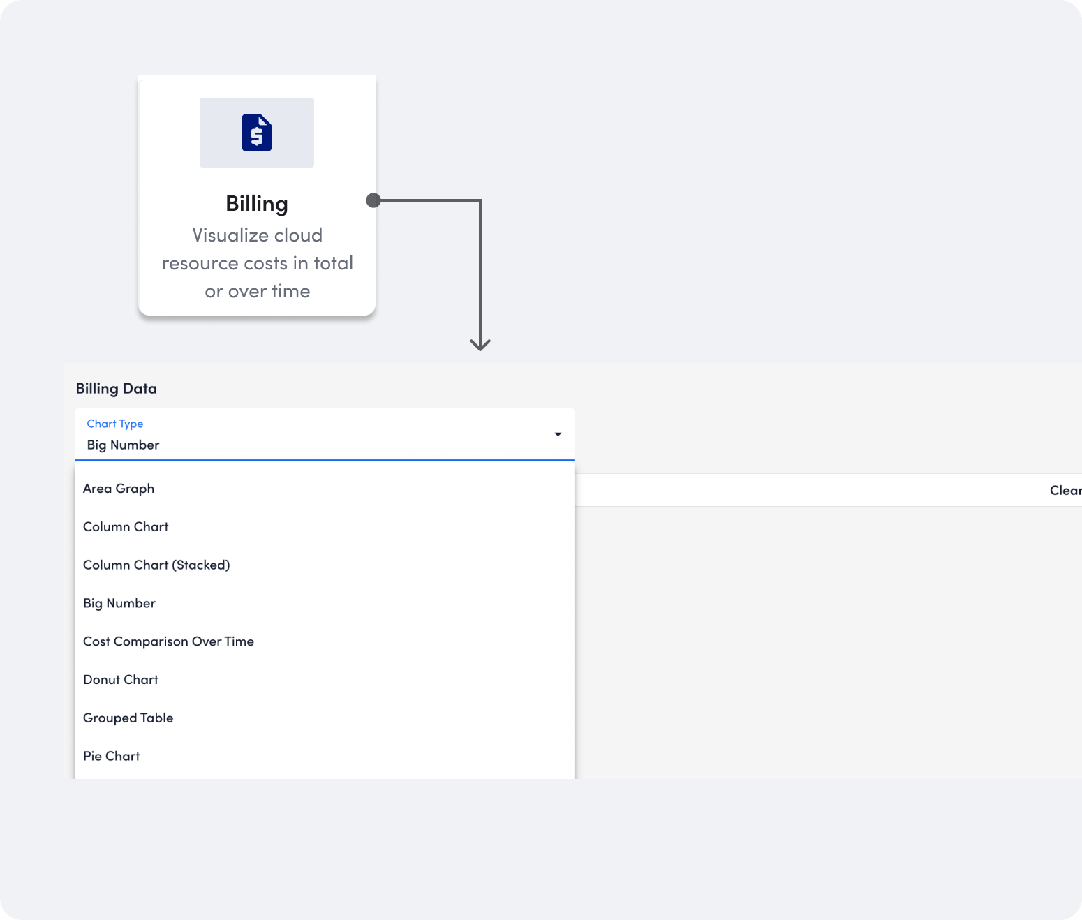
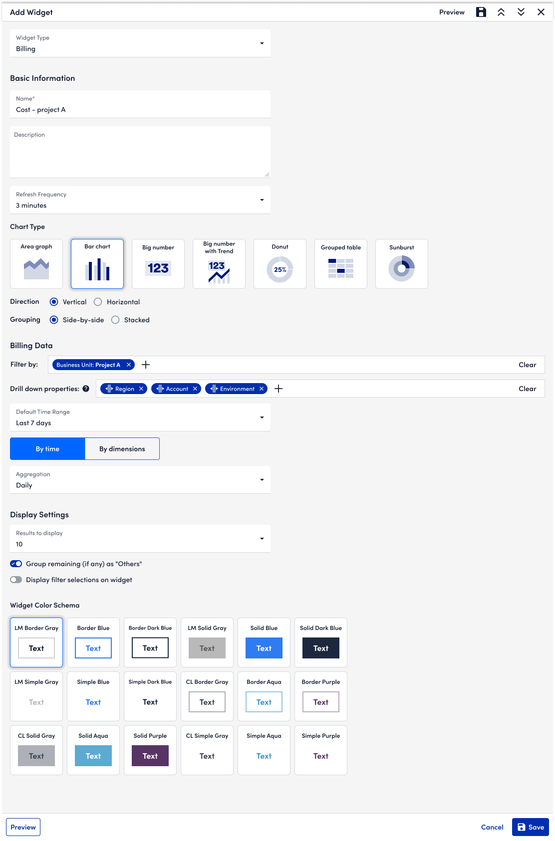
With growing types of visualizations, it's difficult to identify the visualization quickly. Also for bar charts, we have 4 variations (bar chart, column chart, stacked chart, and side-by-side chart), which makes it even more difficult for users to identify the visualization easily. As a result, I used Chart Type to help users select the visualization.
With users' selection of direction and grouping, the bar chart illustration will change accordingly.
Reflections
Three things stayed with me from this project.
Designing for High-Stakes FinOps Decisions. Data visualization is more for viewing. It's for high-stakes decision-making. When designing for displaying data, what also matters is how it supports users' next step actions, such as finding out the spike trigger or observing the anomaly in the process.
Navigating Technical Constraints with Elegant Degradation. The reality of enterprise design is that designers must often build upon legacy architecture. Our platform was built for minute-by-minute infrastructure metrics, but our users worked in calendar billing cycles. Instead of blocking the launch for a perfect backend overhaul, I learned the art of technical compromise. By designing proactive instructional empty states and specifying date range, we managed user expectations gracefully. It's a great lesson for me to practice delivering maximum user value while navigating rigid engineering constraints.
Explore compound diagrams. Every widget we shipped answers one question with one encoding, so a dashboard of them leaves the reader to assemble the story across tiles — spend in one, trend in another, budget in a third. Forecast with Budgets was the only place two encodings shared an axis, and it was the most useful thing we built. I would have pushed that further: what a segment cost and where it is heading, in one frame. We ran out of runway, and a compound chart done badly is two charts fighting over an axis, so we shipped the simple ones. It is still the first thing I would pick up.