Synthetics
Observe the performance of every step in a website transaction, and know which step broke before customers do.
My Role
Timeline
Teammates
Status
Tools
Overview
Modern businesses run on web applications, but teams often have no way of knowing a critical user flow is broken until customers start complaining. By then the damage is done.
Synthetics closes that gap by simulating a customer's clickpath on a website and alerting before real users are impacted. LogicMonitor could already tell you a site was up. It could not tell you that checkout was the step that broke. I owned this end to end, from discovery research and ideation through usability testing and high-fidelity delivery, with a PM and an engineering owner. It shipped.
Context
LogicMonitor is an infrastructure observability platform for IT Ops, serving 2400+ enterprises. It collects data from local servers, cloud resources, websites and IoT devices, puts it on dashboards, and alerts when a threshold is violated.
The last piece of website monitoring
Beyond basic status and latency checks, Synthetics gives companies visibility into how their site's advanced flows perform from their users' perspective. (Business)
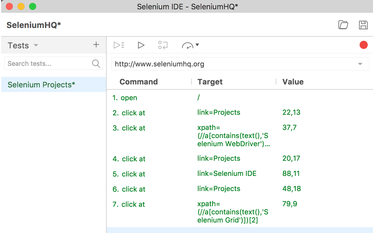
Built on Selenium
Users record their clickpath with the Selenium IDE browser extension, upload the generated script to LogicMonitor, deploy collectors, and get alerted whenever a threshold is violated. (Technical)
LogicMonitor could already alert on an uploaded Selenium file as a whole. What it could not do was tell you which part of a transaction went wrong.
Design question
Where I started on this project
Step-level monitoring is the missing piece.
Users are alerted on Errors and Response time (latency) at both the step and the test level, and the Synthetics page gives them visualization into that data.
Technical constraints
Users will use Selenium, an open source Chrome plugin to record their actions on websites and generate Selenium script. After the script is uploaded to LogicMonitor, to reduce alert noises, commands in a test will be grouped into Steps.
The platform will monitor and send alerts at the Test and Step level. It will provide Command status and response time too.
Track 1 - main view
Viewing Synthetics Tests
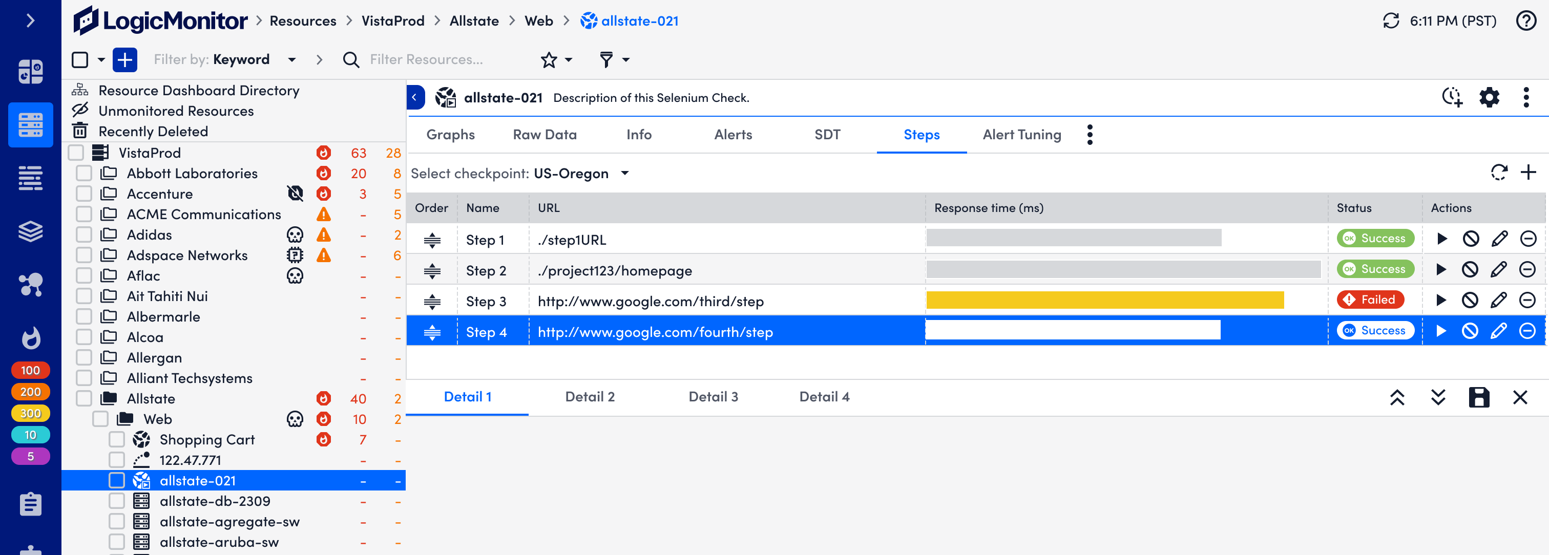
First attempt: Table view
A table felt like enough: organised, clean, one row per step with its result. It meets:
Alerts broken out per step.
Drill down from a step to its commands.
It doesn't work very well in:
It reads as a manually-run test. These run automatically, on a cadence.
No test-level data at all.
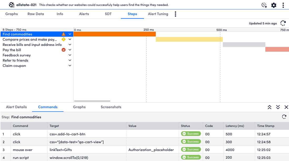
Second attempt: Waterfall
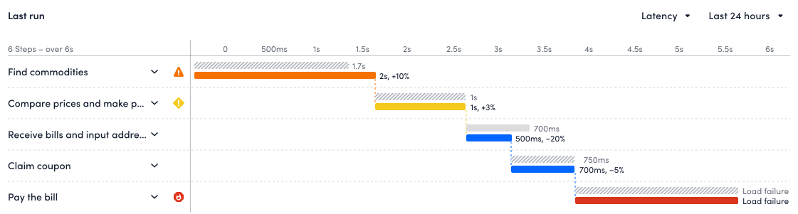
I shifted to using waterfall chart instead: the total latency of the test alongside each step's, the longest step at a glance, and the upstream/downstream context that makes it obvious where the flow broke.
However, after aligning with the team, it still didn't work:
A check configured to run every five minutes has run 288 times in the last 24 hours. Which single run is this waterfall showing? Why that one?
Revisit the product requirements
At this stage, I returned to the product requirements. The solution they described appeared “clear”, but a set of questions sat underneath it, unanswered. Without those answers, any design I produced would be a guess that keeps missing solving the actual problem. Those questions, therefore, became the research questions for my contextual interviews:
- 1
What is users' end goal of using Synthetics?
- 2
What drives users to the Synthetics page in their daily monitoring routine?
- 3
What information are they looking for on the Synthetics page?
- 4
What's the visualization to adopt here, to assist users to read the data and develop actionable insights?
What users told me
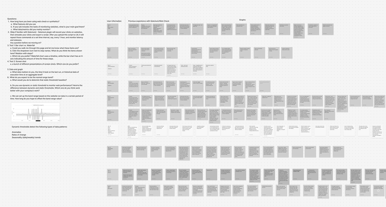
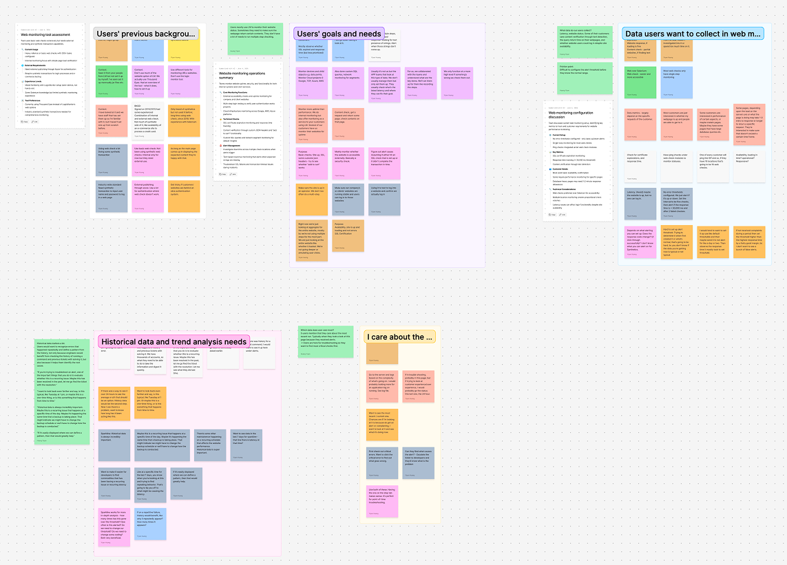
I interviewed 10 enterprise users about their website monitoring goals, the data they collect, and what they go looking for on a Synthetics page.
Historical data is always incredibly important. Maybe this is a recurring issue that happens at a specific time of the day. Maybe it's happening the same time that a backup is taking place. That might indicate we might have to change the backup schedule or we'll have to change how the backup is conducted.
Want to see the most recent one. Chances are if I'm looking at it, it's because somebody got an alert or is complaining. I want to look at it and see what it's doing now.
Visits are driven by alerts. Users open the Synthetics page because something fired or someone complained.
They are trying to find what triggered the alert and get to a root cause.
History carries as much weight as the current run: is this recurring, or a one-off?
Users care about a spike more than a fixed threshold; they don't know the right threshold until they have a baseline.
Brainstorming: Displaying aggregate data
With the question rewritten, I stopped drawing single runs and started drawing aggregates: four directions, each weighed against whether it lets a user spot the one step worth their attention.
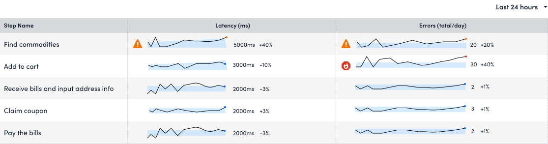
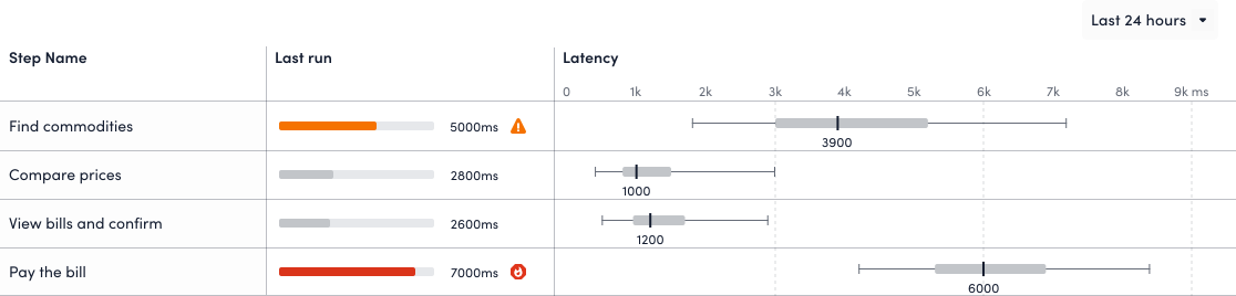
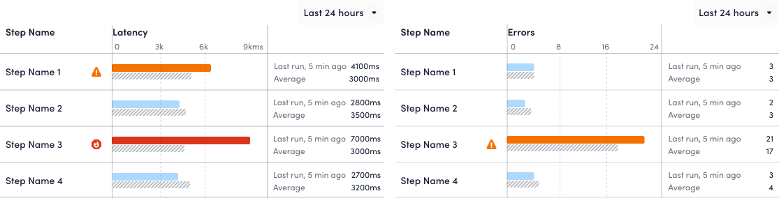
Even though the four visualizations enable users to observe the trend or understand whether a step was out of normal range. There is a shared problem: it's difficult to switch to another test on the timeline to drill down.
Option 1. Sparkline
- Observe trend
- Different Step alerts
- Drill down to commands
Option 2. Whisker plot
Option 3. Bar/Waterfall + baseline
Option 4. Stacked area + table of tests
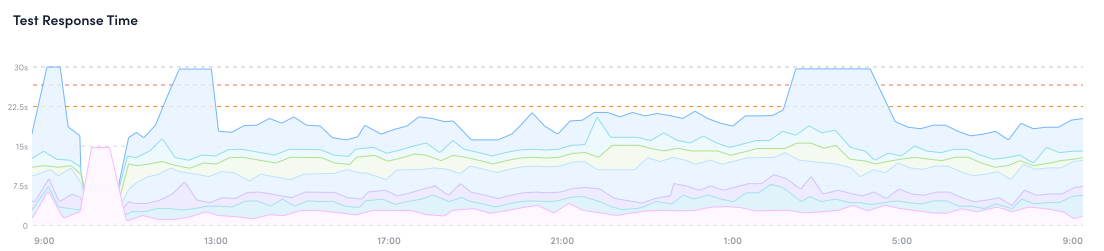
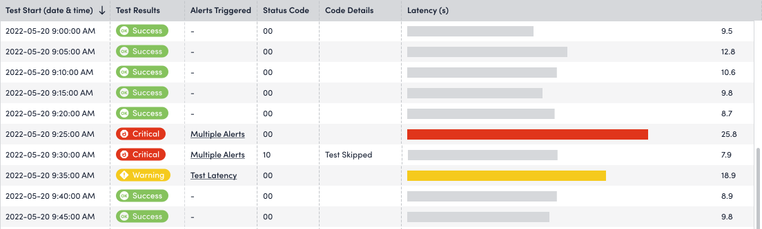
A time-series that carries both the response time of each step and of the test as a whole, with a table of test results underneath. Clicking a point in time opens that run's detail, putting trend and single-run detail in one view rather than two.
The stacked area chart meets the most use cases except “helping users to identify anomaly”. Users may use median, average and standard deviation bands as their baseline range, but for MVP these metrics seemed not that much valuable than alert thresholds. For this design, the baseline metrics were put into post-MVP features.
User testing
To make sure the visualization is aligned with users' expectation and preference, I ran another user testing to understand users' preference.
Which chart users picked
- 6 votes - Stacked area chart
- 2 votes - Waterfall chart
- 1 vote - Sparkline chart
What tripped them up
- 4 users could not read the whisker plot, or said the band needed explaining.
- Users liked the waterfall specifically for showing the transaction in sequence.
These steps processed in a certain order… I like having them on the timeline like this, where you can both see which ones are taking a long time and the order they were happening in.
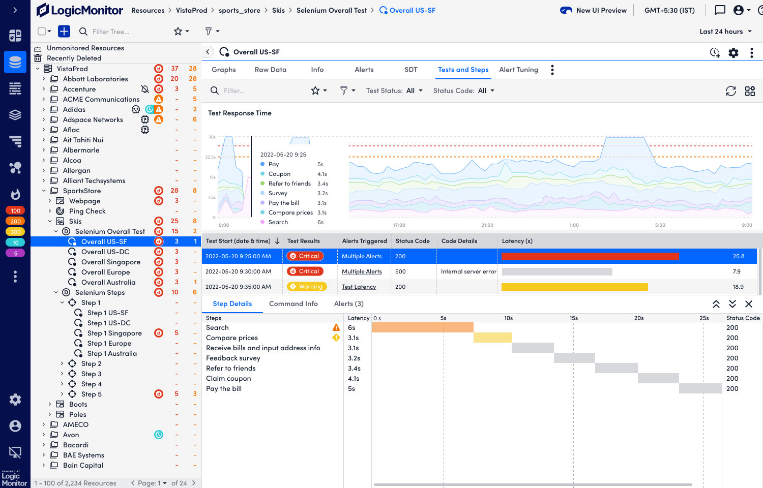
The stacked area wins the trend question and the waterfall wins the sequence question and the page asks both. So the final design uses a stacked area for the Test over time, and a waterfall for the Steps inside whichever run the user zooms into.
Final Design
To make sure the visualization is aligned with users' expectation and preference, I ran another user testing to understand users' preference.
Track 2 - onboarding
Creating Steps
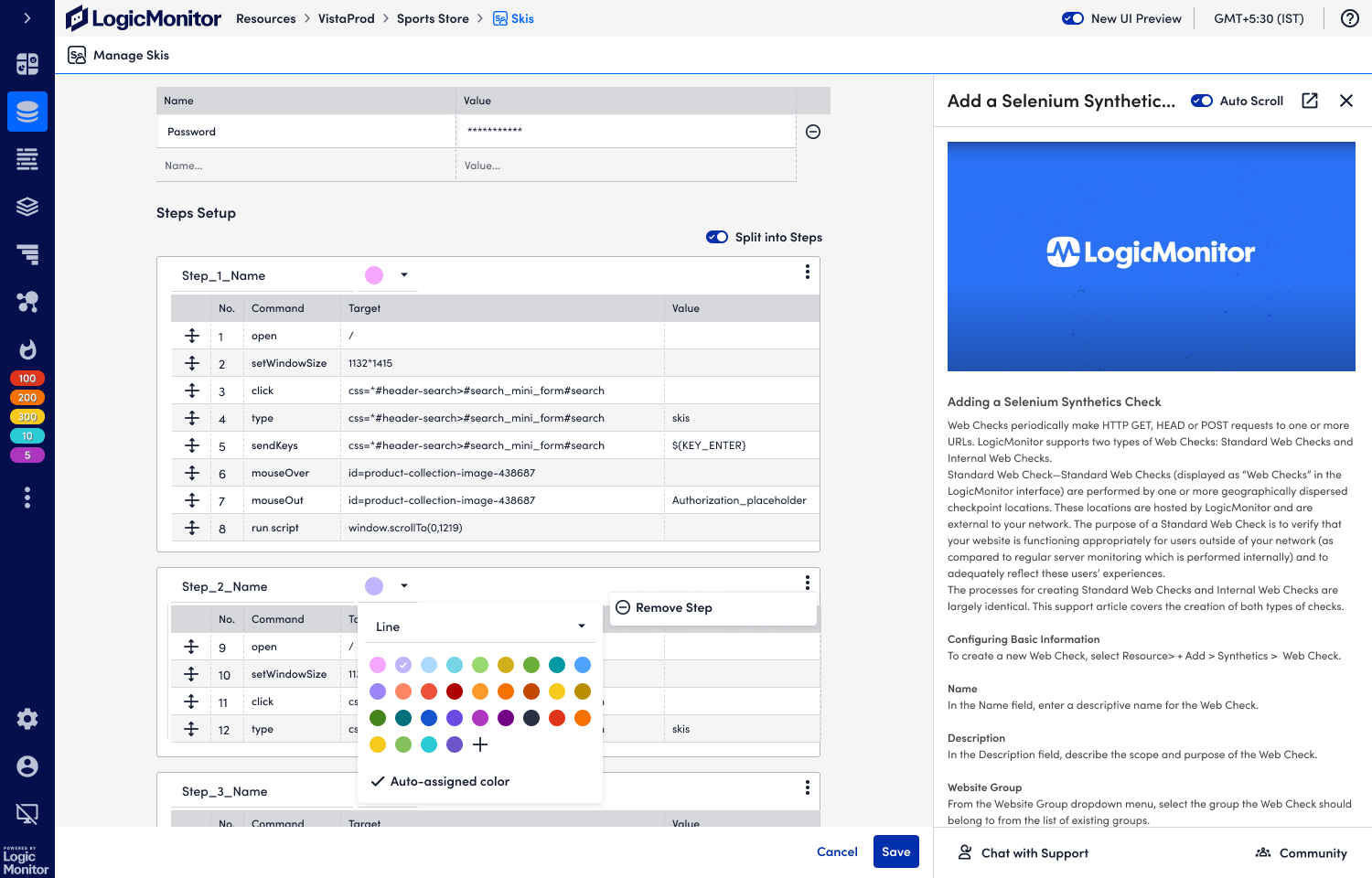
Step is a new concept in the LM context. It's a segment on the onboarding flow of creating Synthetics checks, to allow users to break Selenium Tests into several steps.
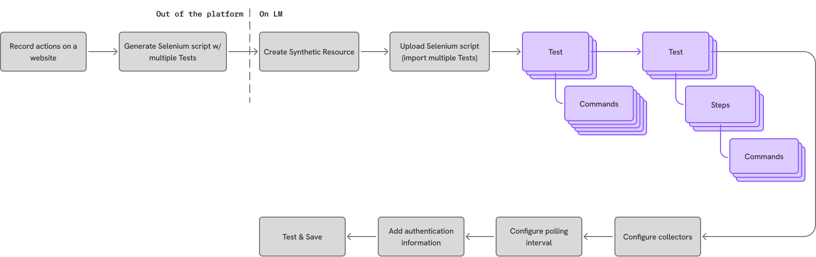
Selenium has no concept of a “Step.” It records raw commands. A Step is the semantic layer LM added on top. For example, “Add to cart” counts as a Step, which contains three commands (click a listing, adjust the quantity, click the button), and only once they are named as one thing can we report latency and error rates for it.
Initial attempts
At the beginning, I thought I just needed to design the interaction for regrouping commands into Steps, and make sure that was clear to users.
However, after aligning with the team, it came to me that one hard constraint shaped every option: users cannot edit the script. Commands run in a fixed order, none can be skipped, and steps cannot be reordered. Users could only draw boundaries in an existing sequence. Both interactions implied users could skip commands, reorder commands, and reorder steps. None of those were supported.
Change directions
Then I explored an option to convey the message to users that the commands cannot be reordered, with an inactive checkbox.
Disabling the checkbox was meant to say “you can't skip this.” It didn't. It fought users' mental model of what a checkbox is.
Final design
The most straightforward interaction is the “Split”, where users could split a script by clicking a button to create steps.
Delivery highlights
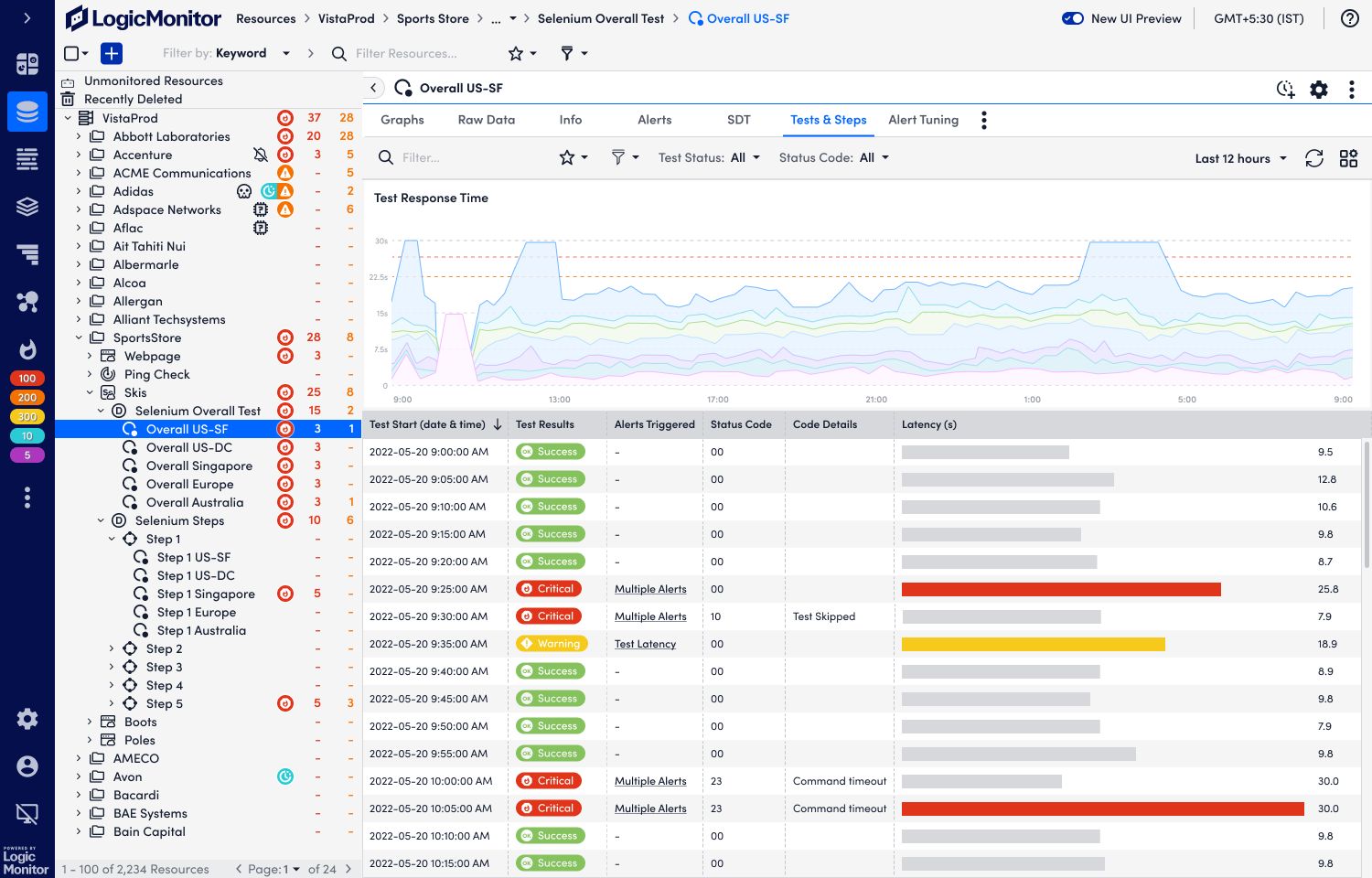
Spot the step with the longest latency
The landing page charts the timeline with step latency broken out. The table below carries the detail of every test run in the range.
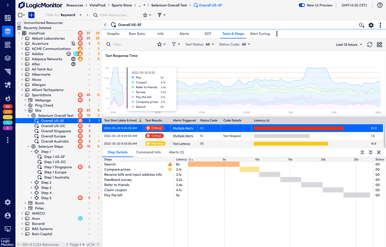
Open a historic run
Going into a past test lets users trace a problem back and troubleshoot it against what actually happened at the time.
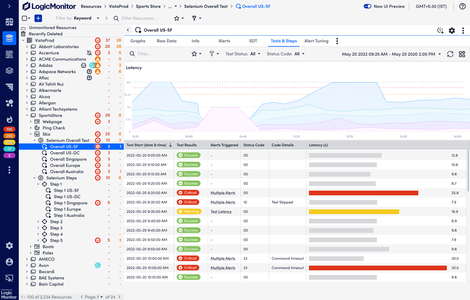
Drag to zoom into a period of interest
Click and drag on the chart to narrow the whole view to the window a user wants to dig into.
Scales to any number of steps
What if a test has 99 steps? Users pick the colours, matching their branding or just telling their steps apart.
Process
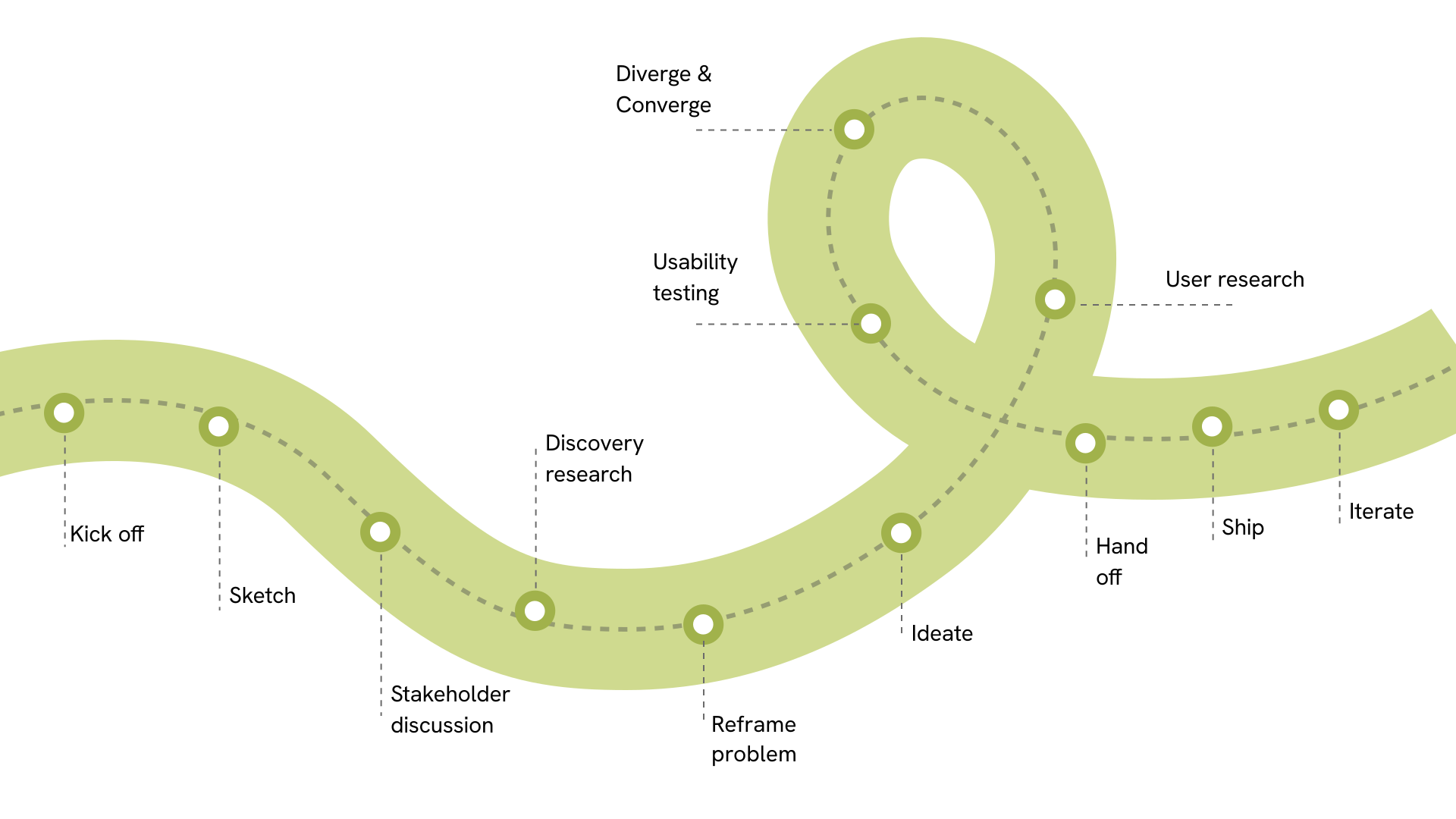
Kick off → sketch → stakeholder discussion → discovery research → reframe the problem → ideate → diverge & converge → usability testing → user research → hand off → ship → iterate. The loop in the middle is the part that mattered: research and testing sent me back to diverge again rather than forward to hand-off.
Reflections
1Know the right problem to solve
Mapping the technical constraints, learning enough of the domain to ask a better question, sitting in an interview until the real pain surfaces. Whichever method it comes from, the work is the same: getting clear on the problem the design actually has to solve. That is why three rewrites of one “how might we” did more here than any single mockup. A design only moves in the right direction once the problem in front of it is the right problem.
2Early alignment in B2B product design is vital
Twice in this project I drew a direction before the constraint that ruled it out surfaced. The waterfall answered for one run when a check on a five-minute cadence has 288 a day. The first two Step interactions implied users could skip and reorder commands, which the platform never supported. Both facts came from engineers and the PM rather than from users, and both arrived after the work was done. In B2B the constraints that decide a design sit with the team. Aligning early costs a conversation; aligning late costs the design.